How we turned dental software into a +300K-view explainer video
May 22, 2026
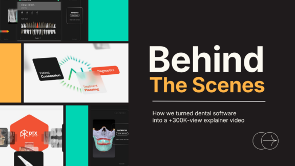
Quick Answer: Behind every high-performing explainer video is a creative process built on one question: how do we make something complex feel simple? In this behind-the-scenes look at the DTX Studio Clinic video we produced for Dexis, our senior design lead, Andrea Uruburok, walks through the decisions that turned a feature-rich dental imaging platform into a clear, compelling story.
Spoiler: it earned over 326,000 views on YouTube (and counting!), and it did not happen by accident.
- Understanding the Real Goal Before a Single Frame Is Designed
- Starting With Story Structure, Not Software Features
- The Creative Freedom That Changed Everything
- Solving the “Too Much to Show” Problem
- Translating Information Instead of Illustrating It
- The Moment That Made the Video
- How This Video Performed and What That Tells Us
- What the B2B Explainer Video Process Actually Looks Like
- Why Behind the Scenes Matters for Marketers, Not Just Creatives
- Stories That Educate, Inspire, and Connect
- Wrap Up: Key Takeaways for Marketing Leaders
- FAQs
Imagine you are a marketing leader at a dental technology company. Your product does something genuinely remarkable: it brings every imaging tool, every scan, every treatment plan, and every collaboration workflow into a single AI-powered platform. It removes a staggering amount of friction from the daily life of a modern dentist.
That is the brief we received from Dexis when they came to us to create an explainer video for DTX Studio Clinic, the flagship imaging hub from Dexis. The platform consolidates diagnostic imaging, treatment planning, AI-powered case presentation, and partner collaboration into one intuitive interface. It is genuinely transformational for dental practices. But with that many capabilities on the table, there is a real risk of creating a video that tries to say everything and lands on nothing.
What followed was a creative process that we think every marketer can learn from. Whether you are launching a SaaS product, a medical device, a data platform, or any solution with significant technical depth, the challenge is the same: turn complexity into clarity. Here is how we did it.
Understanding the Real Goal Before a Single Frame Is Designed
Our senior design lead, Andrea Uruburok, was handed the project with one clear north star.
“When I first explored what the software could do, what stood out to me was how much complexity it was removing from the dental process,” she says. “That immediately felt like the core of the video. I wanted people to understand how advanced the technology is, but more importantly, how it makes things simpler.”
This is a distinction that matters enormously for marketing leaders. Your audience does not want to be impressed by your product’s feature list. They want to see themselves on the other side of a problem. The goal of this video was never to catalog DTX Studio Clinic’s capabilities. It was to show dentists a future where the clutter is gone, the workflow is fluid, and every tool they need lives in one place.
Defining that emotional outcome before any design work begins is what separates a video that performs from a video that just exists. But driving results requires more than production quality. It requires strategic clarity from the very first creative conversation.
Starting With Story Structure, Not Software Features
One of the most common mistakes in product explainer videos is leading with features rather than narrative. Features tell. Stories sell.
Andrea’s first move was to work closely with the script. “A big part of that process was having a strong script, which already gave the story a clear and logical structure to build on,” Andrea explains.
The structure the team landed on follows a clean narrative arc: the problem of fragmented dental imaging workflows, the arrival of DTX Studio Clinic as the solution, and a step-by-step walk-through of the five key benefits the platform delivers. Each timestamp in the final video reflects a deliberate storytelling choice, not just a feature demo:
- 0:01 Introduction: set the tension
- 0:22 One place for all your imaging: the promise
- 1:06 The foundational approach: the “how it works” foundation
- 1:23 Automated case setup: the first real payoff
- 1:37 Elevated patient presentations: the visual wow moment
- 1:55 Accelerated treatment plans: the efficiency proof point
- 2:20 Seamless partner collaboration: the network effect
- 2:56 The intelligent hub for modern dentistry: the resolution and close
This is a story with a beginning, a tension, and a resolution. The hero is the dentist. The villain is fragmentation. DTX Studio Clinic is the guide that makes the chaos disappear.
Let’s take a look at the full video.

The Creative Freedom That Changed Everything
Not every project gives a design lead room to push beyond established brand templates. This one did, and Andrea made the most of it.
“When I was handed the project, I was told it wasn’t strictly tied to brand guidelines and that there was room to explore something fresher,” she recalls. “Taking advantage of that freedom was probably the most important decision I made. It allowed me to trust my instinct and push toward a more modern visual language that better reflects how innovative the technology is, and that choice really shaped the overall tone of the piece.”
For marketing leaders, this is a meaningful takeaway. When you brief a creative team, consider what constraints are truly load-bearing and which ones are just habits. Brand consistency matters. But rigid adherence to old visual systems can actually undermine your message, especially when the message is about innovation, progress, and modernity.
A fresher visual language did not dilute the Dexis brand. It amplified what the product actually stands for. The resulting video feels like something you would expect from a cutting-edge technology company, which is exactly the perception they needed to build in the market.
Solving the “Too Much to Show” Problem
Every product marketer has faced this moment. Your product does a lot. Your stakeholders want it all included. And you have ninety seconds to three minutes before the viewer’s attention is gone.
This was the central creative challenge Andrea had to navigate. “Very early on, it became clear that the biggest challenge was how much the software could actually do,” she says. “There are so many tools and possibilities that it can easily become overwhelming if everything is shown at once. So instead of trying to include everything, I focused on prioritizing. I highlighted the most important tools and built the visuals around them, using supporting graphics to guide the viewer and keep the message clear without losing depth.”
The solution was not simplification through omission. It was simplification through hierarchy. Andrea chose every visual element to support one of the core benefit stories. She used supporting graphics not as decoration but as navigational tools that helped the viewer track where they were in the story.
This is the discipline that separates good video production from great video strategy. According to HubSpot’s 2024 State of Marketing Report, short-form and explainer videos consistently rank as the highest-ROI content format for marketing teams. The reason is not that they are short. It is that the best ones are ruthlessly focused on one problem, one solution, and one emotional outcome.
Translating Information Instead of Illustrating It
There is a subtle but critical difference between illustrating a product and translating it. Illustration is decorative. Translation is transformative.
“At the beginning, it was really about understanding what Dexis is trying to say at its core: taking something complex and making it simple through AI,” Andrea explains. “From there, I focused on translating the information instead of just illustrating it. That meant breaking down technical ideas into their essence and rebuilding them as clear, step-by-step visuals.”
In practice, this meant asking a different question at every stage of design. Not “how do we show this feature?” but “what does this feature make possible, and how do we make that feeling visible?”
This philosophy is at the heart of how we work at Digital Brew. A platform interface screenshot does not tell a story. A visual metaphor that shows fragmented tools being replaced by one unified hub does. Motion, pacing, and visual hierarchy were all deployed in service of one goal: helping viewers understand, not just observe.
The Moment That Made the Video
Every great piece of creative work has a defining moment. For the DTX Studio Clinic explainer video, Andrea knows exactly where hers is.
“There’s a moment around the 47-second mark, when DTX Studio Clinic is introduced, that really stands out to me,” she says. “The transition from the wave using the DTX spectrum palette into the different UI layouts came together very close to how I imagined it from the start. It’s one of those points where everything aligns: the pacing, the visuals, and the clarity, while still showing multiple features without making it feel heavy.”
This is the kind of moment that is planned but also earned. It does not happen without a clear brief, a strong script, creative freedom, and a designer who understands both the product and the story it needs to tell. The wave transition was not just beautiful. It was a visual metaphor for the product’s core promise: one unified flow replacing fragmented complexity.
For marketers, this is worth noting. The moments in a video that your audience remembers are rarely the ones that explain the most. They are the ones that feel the most true.
How This Video Performed and What That Tells Us
The DTX Studio Clinic video has earned over 326,000 views (and counting!) on Dexis’s YouTube channel. For a B2B product video targeting dental professionals, that is not just a vanity metric. That is reach that translates into brand awareness, product consideration, and sales enablement for a specialized and competitive market.
What drove that performance? A few things that any marketing team can replicate:
- A clear, emotionally resonant central promise: one platform, zero chaos.
- A narrative structure that respects the viewer’s intelligence and time.
- Visual design that reflects the innovation level of the product itself.
- Strategic restraint: showing what matters most, not everything that exists.
Research from McKinsey shows that companies that invest in clear, compelling communications for complex products see significantly higher customer comprehension and faster purchase decisions. Clarity is not just a creative virtue. It is a commercial advantage.
What the B2B Explainer Video Process Actually Looks Like
For marketing leaders considering a similar project, here is a transparent look at the phases that shaped this video:
| Phase | What Happens | Why It Matters |
|---|---|---|
| Discovery | Understand the product, the audience, and the core message | Sets the foundation for everything that follows |
| Scripting | Build the narrative arc and prioritize key messages | Gives the design team a story to work with, not just a feature list |
| Visual Design | Develop the style, motion language, and visual hierarchy | Shapes how the message feels, not just how it looks |
| Animation | Bring the story to life frame by frame | The moment strategy becomes experience |
| Review and Refinement | Align creative execution with business goals | Ensures the video works as hard as the product does |
Why Behind the Scenes Matters for Marketers, Not Just Creatives
You might be wondering why a behind-the-scenes breakdown belongs on a marketing blog rather than a design blog. Here is the honest answer: because the decisions that made this video successful were not just creative decisions. They were strategic ones.
Choosing to prioritize one emotional outcome over a feature catalog is a marketing strategy decision. Giving the creative team room to push beyond existing brand templates is a marketing leadership decision. Structuring the script around a clear narrative arc rather than a product walkthrough is a content strategy decision.
According to a Forbes study, customers who watch a brand video are 1.81 times more likely to make a purchase than those who have not seen one. But that lift does not come from just any video. It comes from a video built on a strategy, not just a production order.
The Dexis DTX Studio Clinic video worked because everyone involved understood that the job was not to make a video about the product. The job was to make the product’s story clear.
Stories That Educate, Inspire, and Connect
At Digital Brew, we believe that the best videos do not just get views. They drive action, change how a buyer sees a product, and help a sales team have better conversations.
The Dexis project proves what happens when you apply that philosophy with discipline and creative courage. We took a product with many features and built it into a story with one central truth: dentistry does not have to be complicated.
That kind of clarity does not come from a bigger budget or a longer timeline. It comes from a creative process that starts with the right question: what does this product make possible, and how do we make that feeling visible?
Wrap Up: Key Takeaways for Marketing Leaders
If you are leading a video project for a complex B2B product, here is what the Dexis case study teaches us:
Define the emotional outcome first. The goal is not to show your product. The goal is to show your audience what their world looks like after your product solves their problem.
Invest in the script before the design. A strong narrative structure makes every downstream creative decision easier and more purposeful.
Prioritize ruthlessly. A video that tries to say everything lands on nothing. Choose the most important story and tell it with depth.
Give creative teams room to explore. Brand consistency matters, but creative freedom within strategy is what produces work that is genuinely memorable.
Treat the video as a business tool. Distribution, context, and follow-through determine whether the views translate into the pipeline.
Let’s Brew This!
FAQs
For most B2B products, the sweet spot is between 90 seconds and three minutes. The DTX Studio Clinic video runs just under three minutes because the product has multiple meaningful use cases worth walking through. That said, length should always serve the story, not the other way around. A focused 90-second video will outperform a bloated four-minute one every time.
Start with the buyer’s most painful problems and work backward to the features that solve them. The question is not “what can this product do?” but “what does this buyer need to believe to take the next step?” Everything that supports that belief belongs in the video. Everything else can live in a longer-form demo or sales conversation.
The best approach is to treat brand guidelines as a foundation, not a ceiling. Core elements such as voice, visual identity, and key messages should stay consistent. But within that frame, the creative team should have room to interpret the brand in ways that reflect the current state of the product and the audience’s expectations.
Results come from three things working together: a clear message that resonates with a specific audience, strategic distribution in the right channels at the right moments in the buyer journey, and a strong call to action that makes the next step obvious.